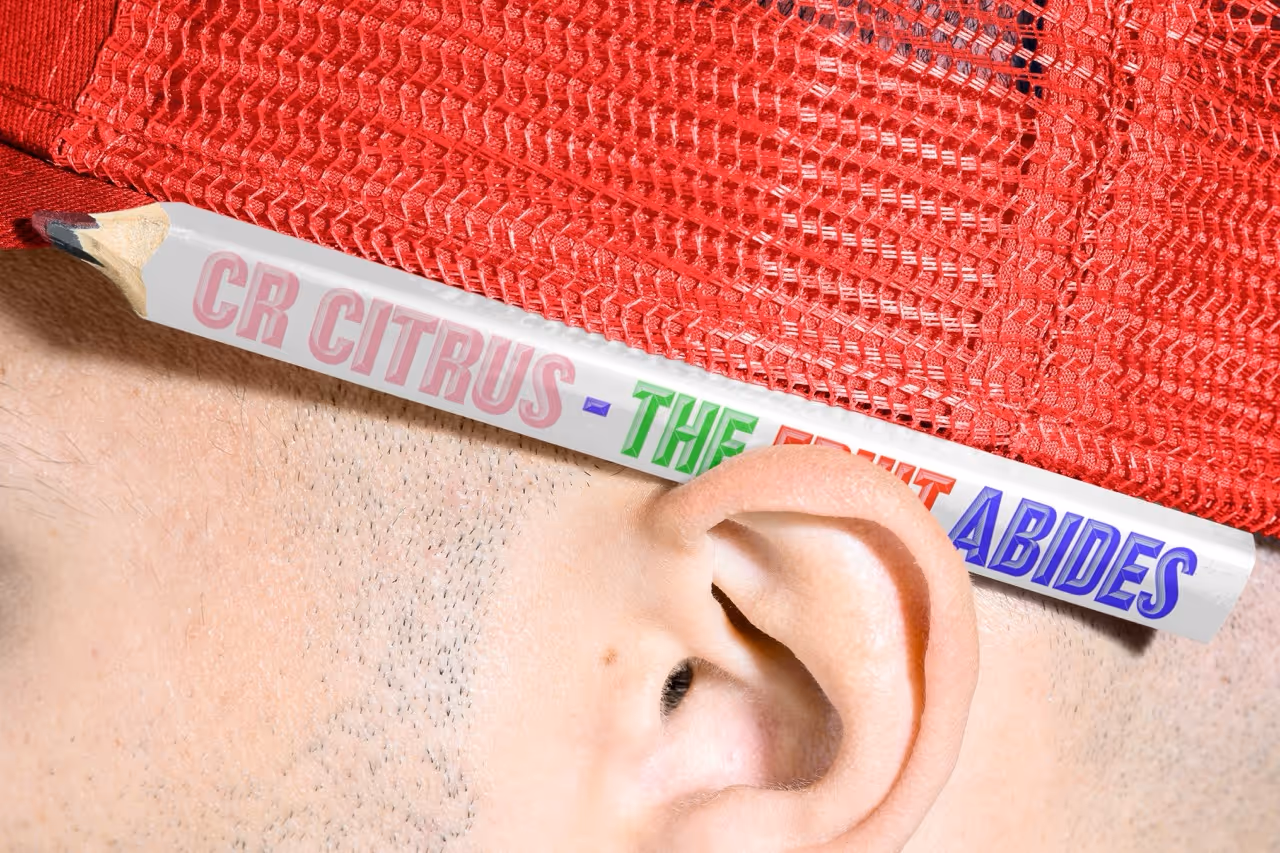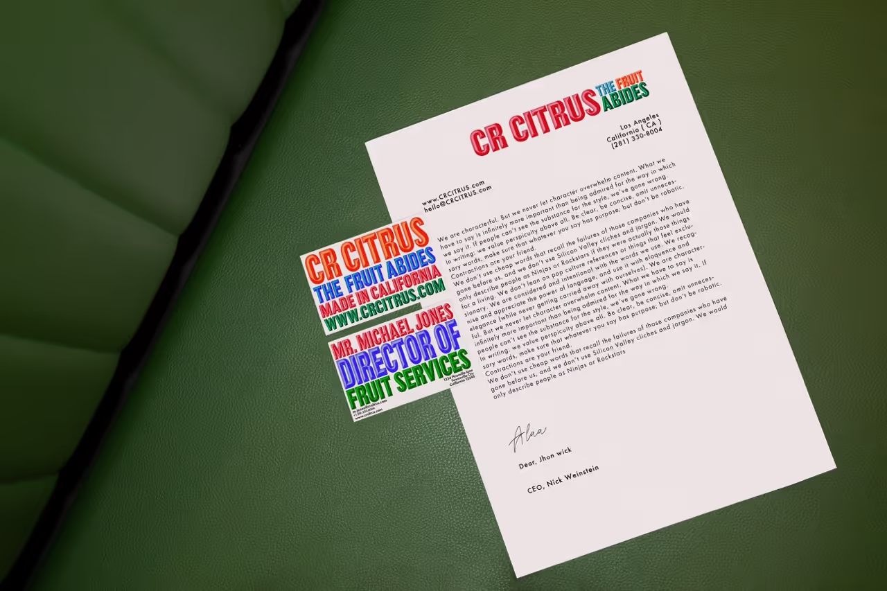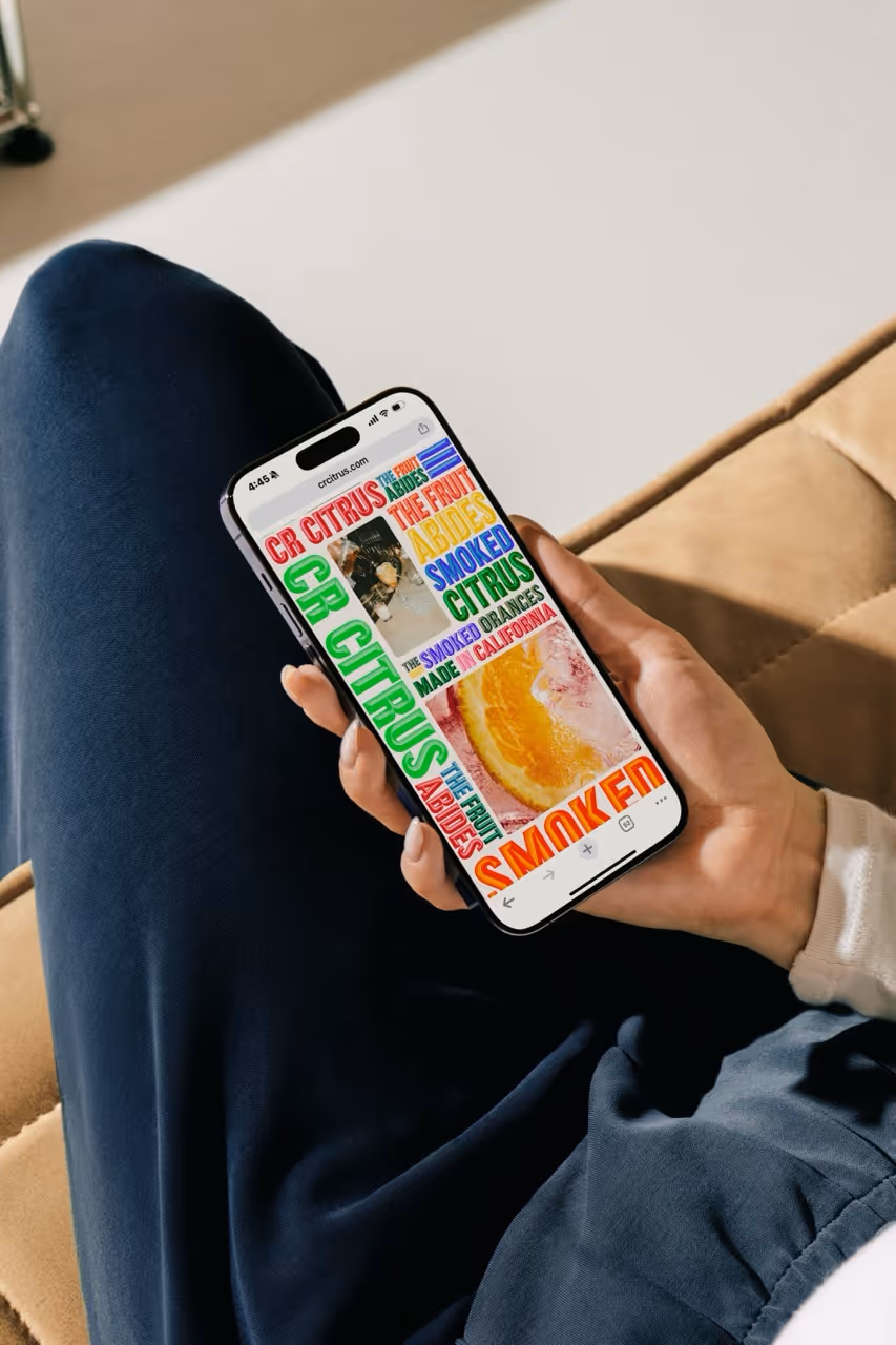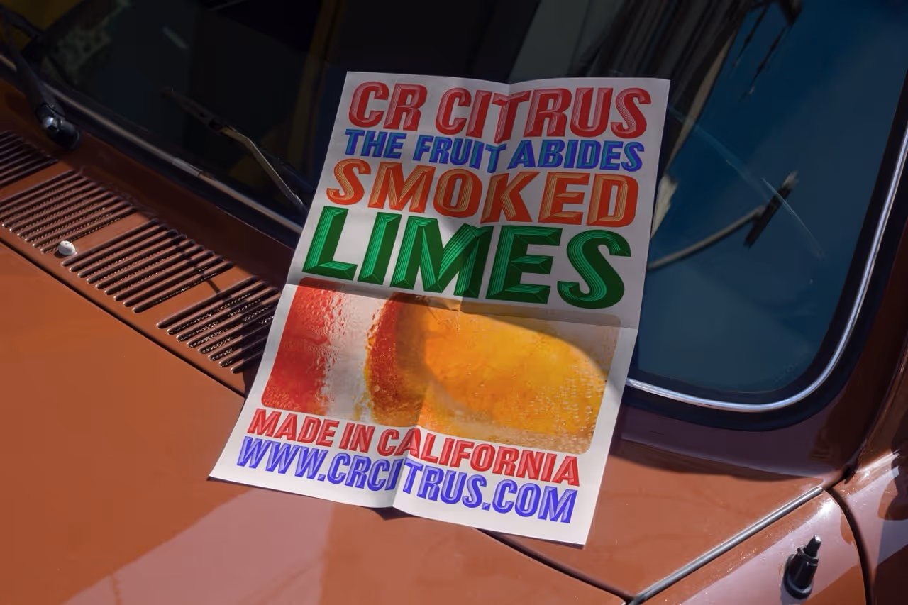
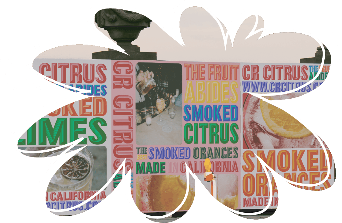
CR Citrus had a great product and a founder who clearly cared about it—but the brand didn’t carry any of that energy. The packaging felt like an afterthought, and the design language didn’t do the product justice. The goal wasn’t just to make it more attractive—it was to give it a visual system that felt specific, alive, and capable of growing with the business.I led a full rebrand from the ground up: logo, wordmarks, typography, color palette, packaging mockups, and usage guidelines. I started with Thorowgood Grotesque, a typeface with built-in credibility and structure, and paired it with engraved letterforms to deepen the sense of heritage. Then I pushed the color palette into high gear—bright, rotating triads that made the brand feel flavorful, expressive, and immediate. The tension between that structure and that vibrancy became the core of the system.
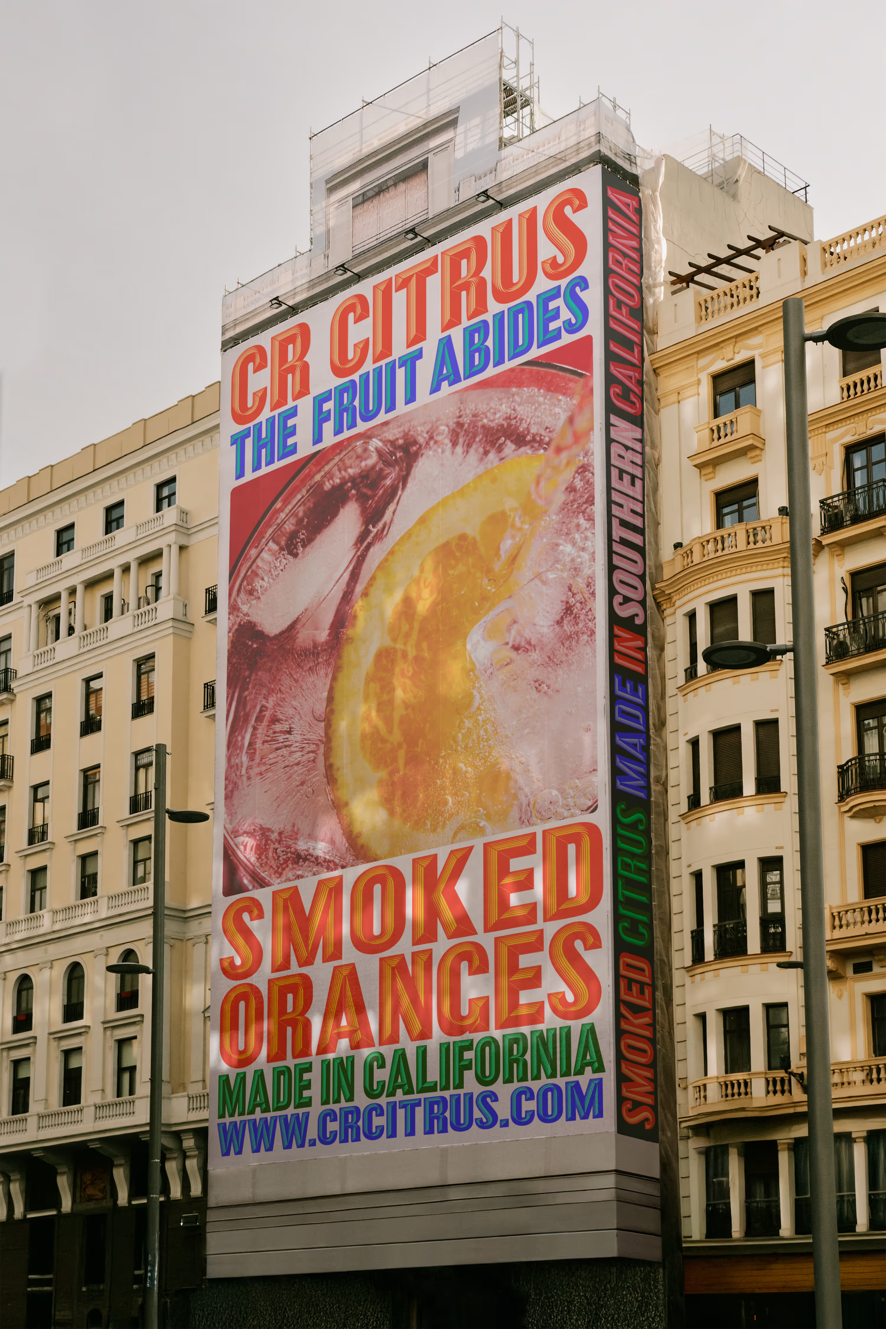

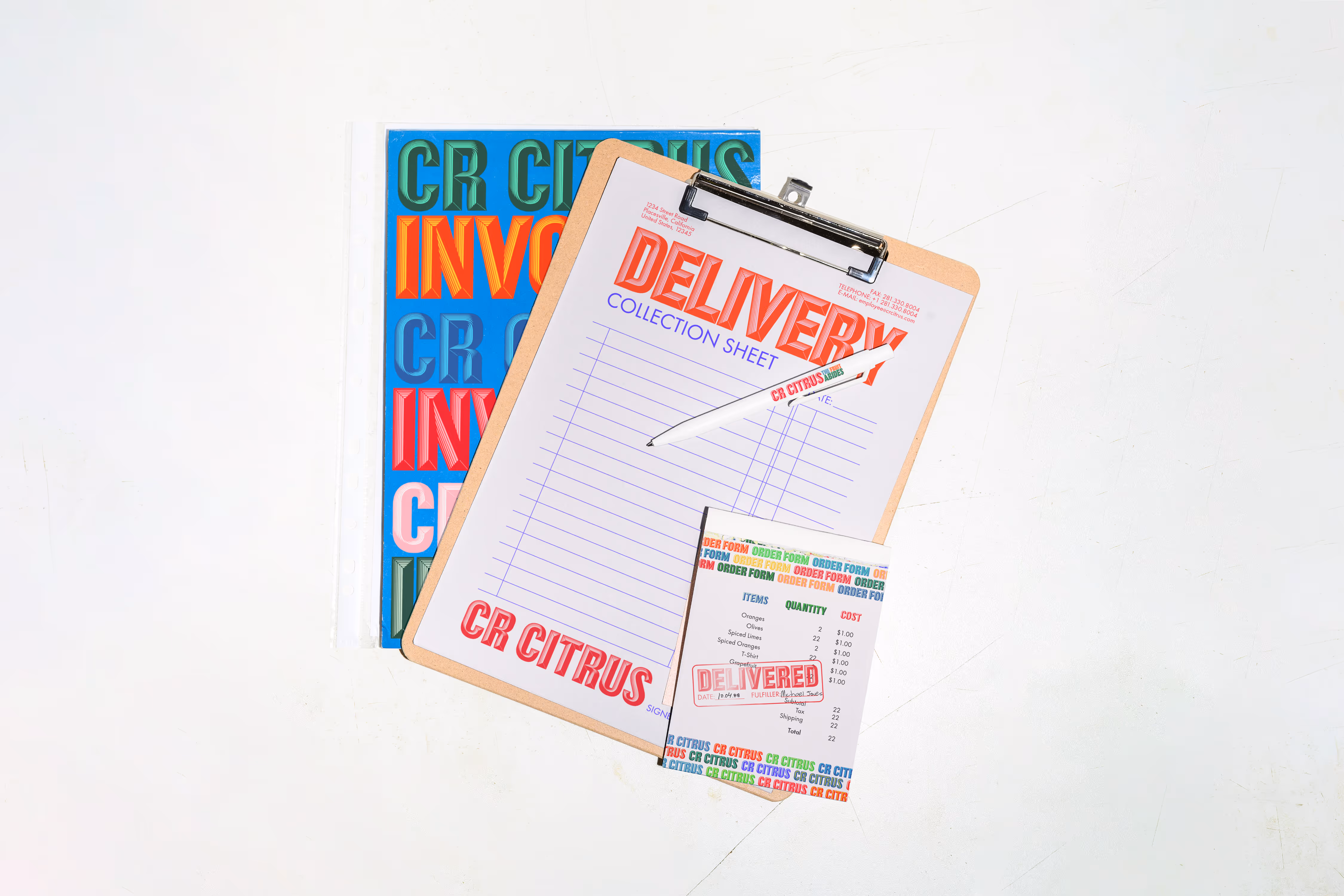
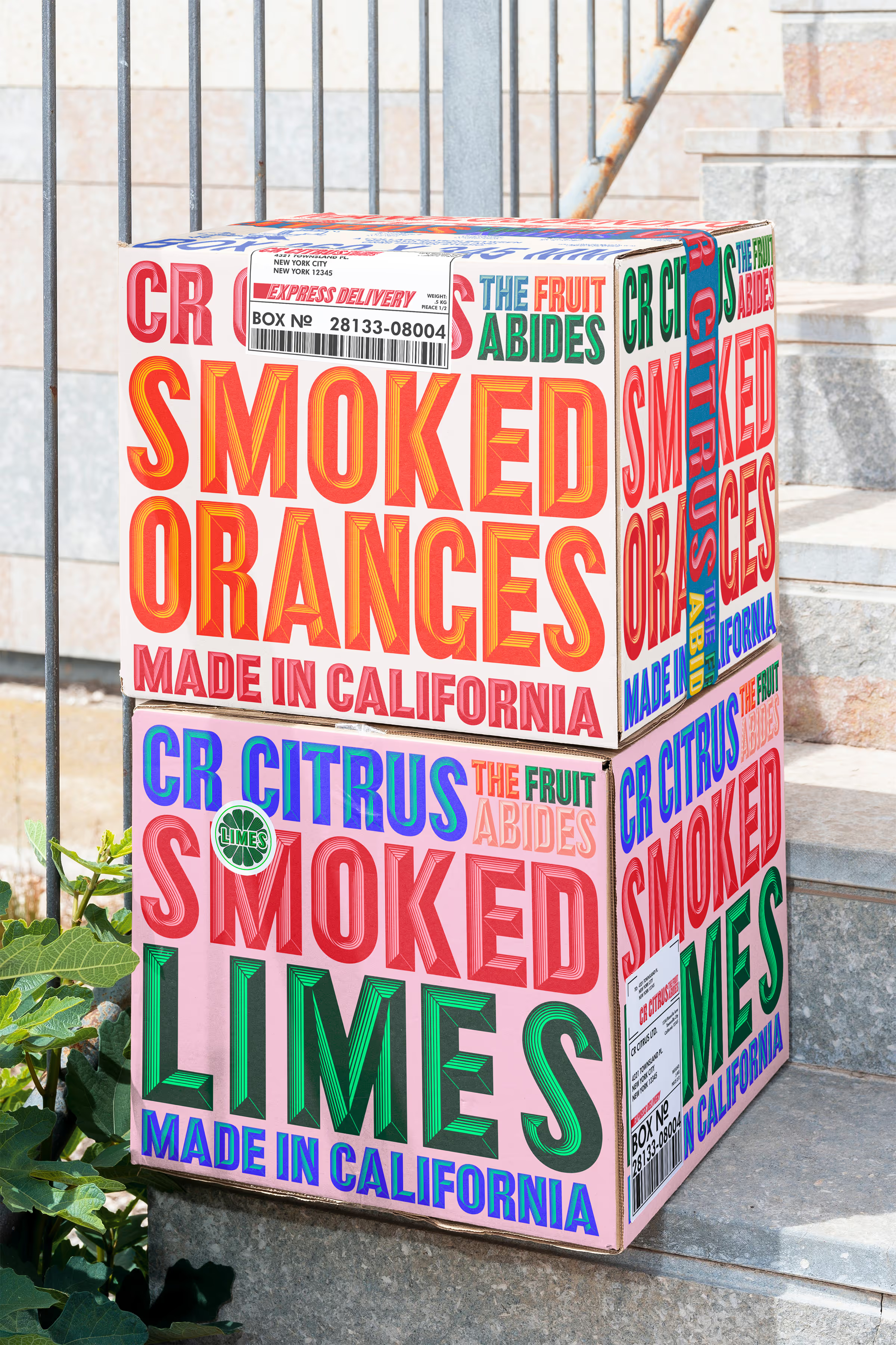
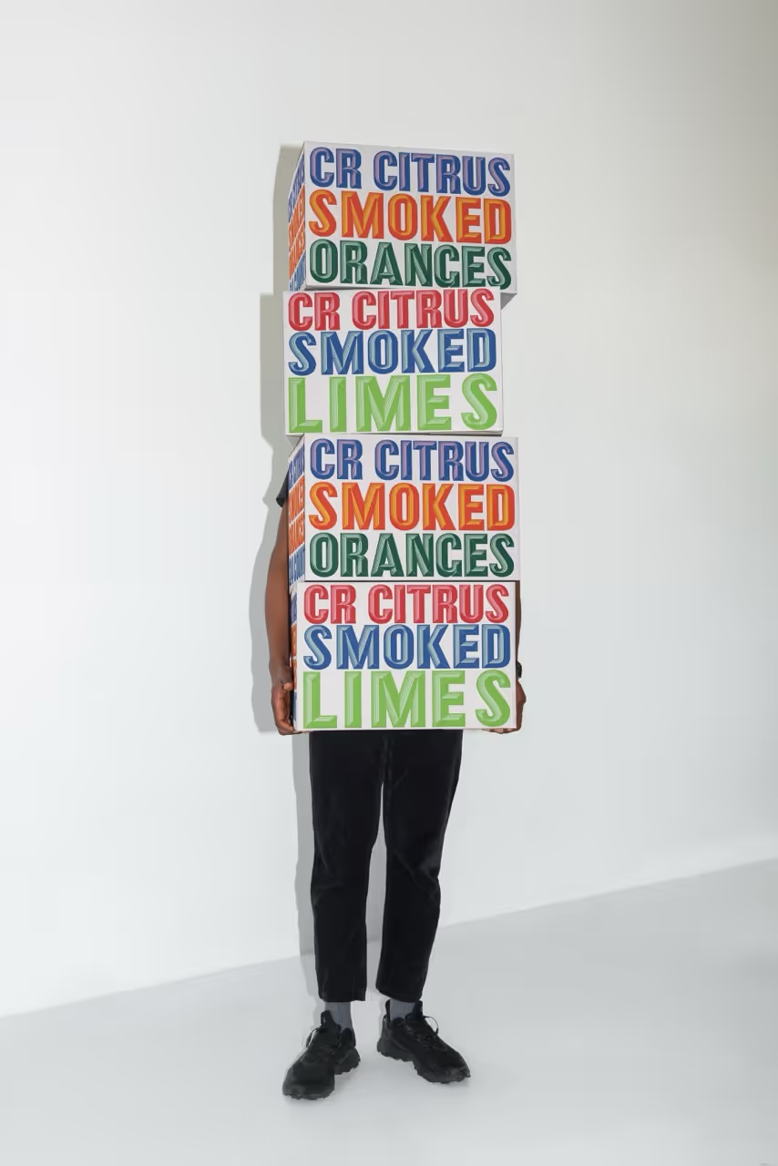
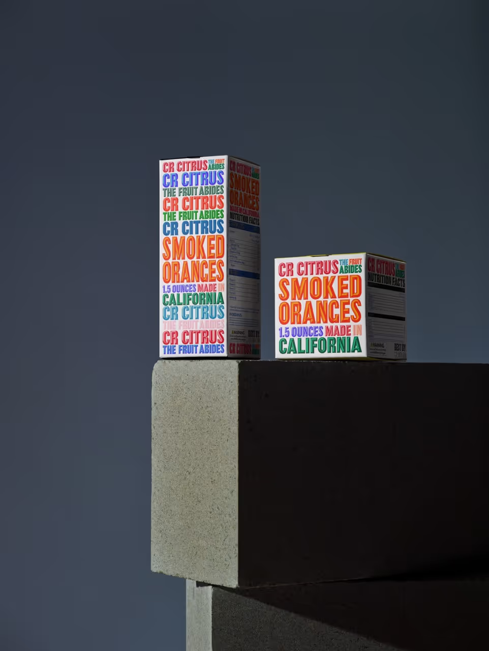
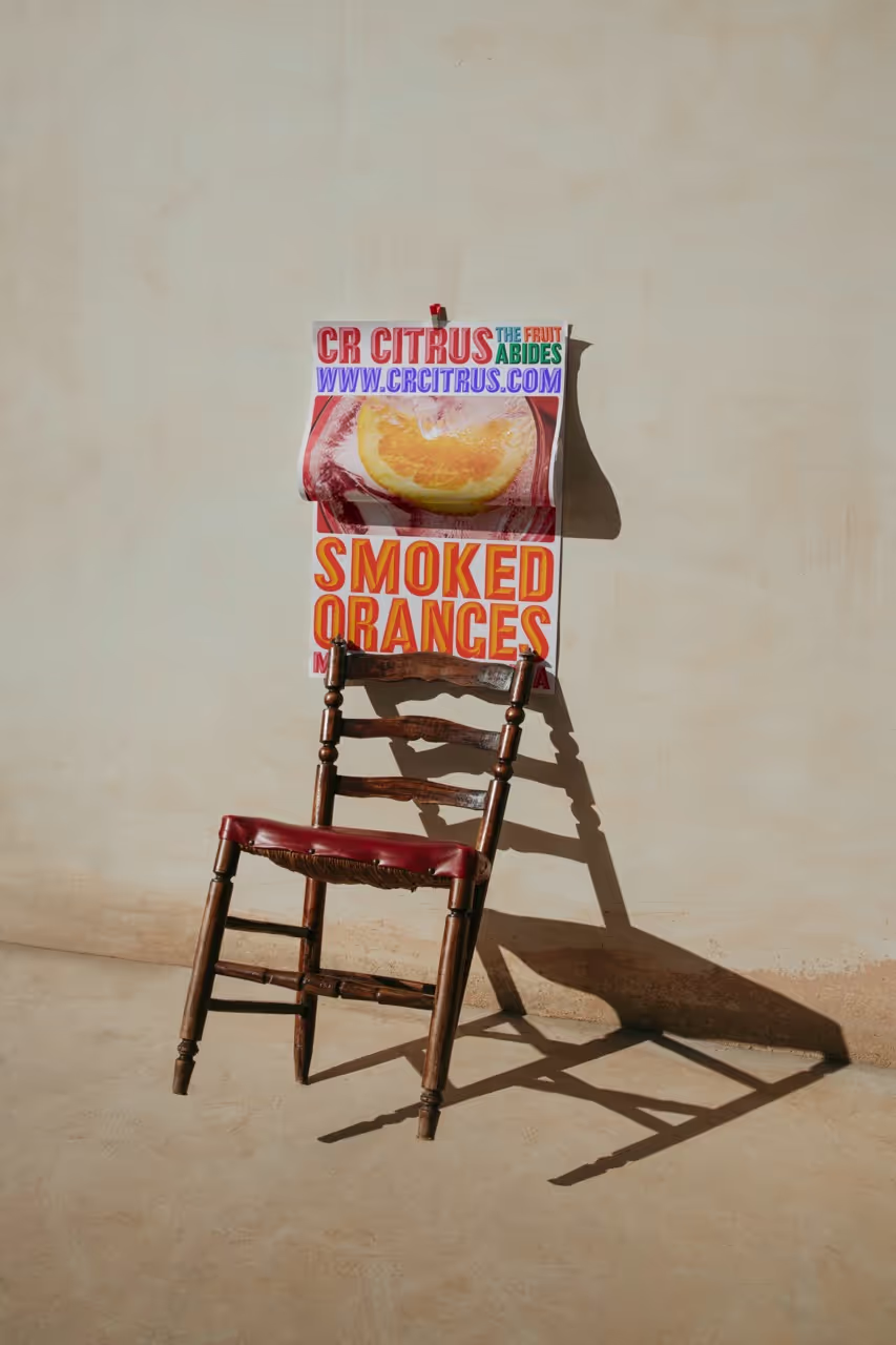
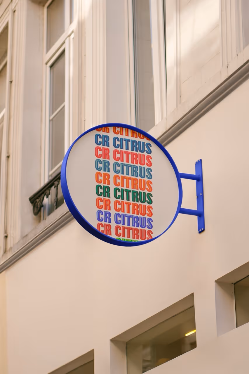
Beyond the identity, I built a practical framework for how everything shows up—print, digital, physical. Posters, signage, postcards, bags, business cards. Not just assets, but rules and rhythms for how the pieces work together. The result was a brand that could flex without losing itself.The new system rolled out across everything. It clarified what the product was, and made it easier to sell—not by dumbing it down, but by giving it the kind of design presence that actually reflects the level of thought behind it. It didn’t just look better—it felt like a brand people could believe in.